 Enterprise Package
  Integrations
  Security
  Hardware
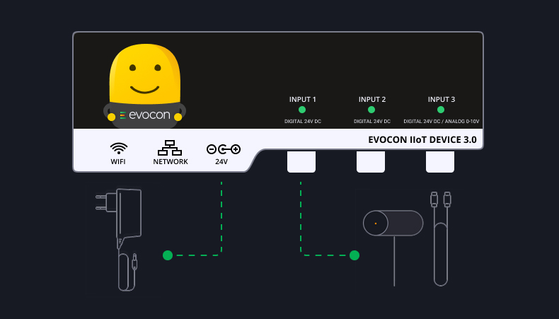
 How Evocon Works
  OEE Monitoring
  Increasing Productivity
 OEE Calculator
  Evocon
  Join us
 In manufacturing, time and efficiency are essential. One key component of time management is understanding how long your machines are working and how long they are stopped. A downtime report is critical when examining factory data and ensuring maximum efficiency.
What is Production Downtime?
Production downtime is any time that your machines are scheduled to work, but are stopped instead. This can be for a number of reasons, such as maintenance, cleaning, changeovers, malfunctions, meetings, or other unforeseen circumstances. We separate downtime into two categories: planned and unplanned downtime.
For the purpose of calculating OEE, we do not include planned activities such as maintenance shutdowns or major plant overhauls, as they are not categorized as availability losses. Similarly, where there is a lack of demand, or if seasonality determines your shifts or workdays, they should also be excluded from OEE calculation.
Planned downtime
Planned downtime, or planned stops, is the time when equipment is scheduled for production but is not running due to a planned event. Some examples of planned downtime are tooling adjustments, cleaning, planned maintenance, and quality inspections. In addition to these, there are other planned stops that should be taken into account, like paid rest breaks, team meetings, etc.
Unplanned downtime
This is downtime that is not planned and disrupts your production. It is due to an unexpected event related to people, machines, materials, or the environment. It includes equipment breakdowns, unplanned maintenance, a lack of operators or materials, and upstream or downstream bottlenecks that cause your lines to stop.
Read this article for more in-depth information on the differences between planned and unplanned downtime.
The Impact of Downtime on Manufacturing Efficiency
The consequences of downtime can be far-reaching. Not only does it lead to immediate production losses, but it also disrupts the entire supply chain. It can have a ripple effect on the overall efficiency of a manufacturing operation, as well as creating bottlenecks in the production process, causing delays and inefficiencies in other areas. For example, if one machine breaks down, it may affect the entire production line, causing delays and lost productivity. Along with decreasing productivity, it causes delays in delivering products to customers. This results in dissatisfied customers and potential loss of business.
It can also negatively impact employee morale and productivity. When machinery or equipment is not operational, employees may be unable to perform their tasks, leading to idle time. It can be frustrating for workers when their day is constantly interrupted to check and fix machines.
In addition to the immediate effects, downtime can result in increased wear and tear on machinery. When equipment is not in use, it can deteriorate faster, requiring more frequent maintenance and repairs. This leads to additional costs and further disruptions to production.
Many manufacturers rely on downtime reports to mitigate the impact of downtime. These reports provide valuable insights into downtime events’ frequency, duration, and causes. By analyzing this data, manufacturers can identify patterns and trends, allowing them to take the necessary measures to minimize downtime and improve overall efficiency.
Key Elements of an Efficient Downtime Report
An efficient machine downtime report enables manufacturers to identify the causes of downtime, measure its duration, and evaluate its impact. By capturing and analyzing this information, you can understand why your machines are down, create a plan to resolve any issues you have and increase your overall efficiency.
Identifying downtime causes — This is the first step when you decide to create a downtime report. There can be numerous reasons why your machines are down, so the first thing you should do is list and categorize your downtime reasons. This could include equipment malfunctions, material shortages, prolonged changeover times, or human error.
Measuring downtime duration — The next step is to measure how long and often your machines are down. By tracking the duration and frequency of stops, you can understand which reasons require the most focus. You should look at the data over a period of time and combine all of your stops—micro stops, short stops, and long stops—to get a full understanding of the duration machines are not operational.
Evaluating the impact of downtime — Now that you’ve collected the data, you can analyze and evaluate your results. With an understanding of why your machines are down, for how long, and what percentage of planned time is lost due to different downtime reasons, you can now start to strategize, plan, and implement corrective actions.
Using Technology for Downtime Reporting
Creating a downtime report is easier than ever, thanks to modern technologies. In the past, companies relied on paper reports to analyze why machines were down, how long, and what was done to correct any issues. The information gathered was often inaccurate and unreliable for a number of reasons:
- Paper reporting usually meant operators would write down any downtime when they noticed a machine was not operational. With this method, your operators would need to know exactly when the downtime occurred and when the machine was functioning again. This can lead to inaccurate information, as operators would often need to estimate the times.
- One of the most important parts of a production downtime report is the reasons for stoppages. By having operators write down reasons, you can have the same reasons being recorded differently, making it difficult to categorize them and notice trends. Organizing the data can take a lot of time and can prove difficult to sort accurately.
- In order to fully analyze the data, the paper records would then need to be transferred to an Excel spreadsheet or similar, to be then organized and analyzed before any corrective actions can be put in place. This takes a lot of time that could be spent on strategic planning or other work.
Benefits of automated downtime reporting
All of the above issues with paper reporting can be addressed using technology and automated downtime reporting.
Using technology to track stoppages means that your data is accurate. Each stoppage is tracked in real-time, so there is no estimating from your operators after they notice a machine is down.
By using automated reporting, you can have pre-specified reasons for all downtime, meaning that the data you receive is fully categorized and ready to interpret.
With all of your data fully organized in your system, you can start visualizing your data instantly. This saves time that would usually be spent inputting all your data into a spreadsheet before you can begin analyzing.
Choosing the right downtime reporting software
But how should you choose the right downtime tracking software? Each software you find on the market will have different pros and cons. There are a few main points to consider when choosing what’s best for your business.
When you begin choosing your software, consider factors such as data-capturing capabilities, ease of use, and integration with existing systems. Try to select a solution that aligns with your specific manufacturing needs and allows for customizable reporting and analysis.
Downtime Tracking Software
Start measuring and managing your downtime with Evocon’s 30 day free trial.
Tracking Downtime with Evocon
There are various ways to track downtime with Evocon. In most cases, companies use different features to measure and track downtime depending on the timeframe they want to track.
- Reports
Evocon’s Reports feature enables managers to get a quick, insightful, visual view of their machinery downtime. Reports are usually viewed weekly and monthly. In the downtime report, you can see different layers, do time-based analysis, compare stations, compare operators and shifts, and at the highest level you can compare factories. We go into more detail on creating a downtime report with Evocon later in this article.
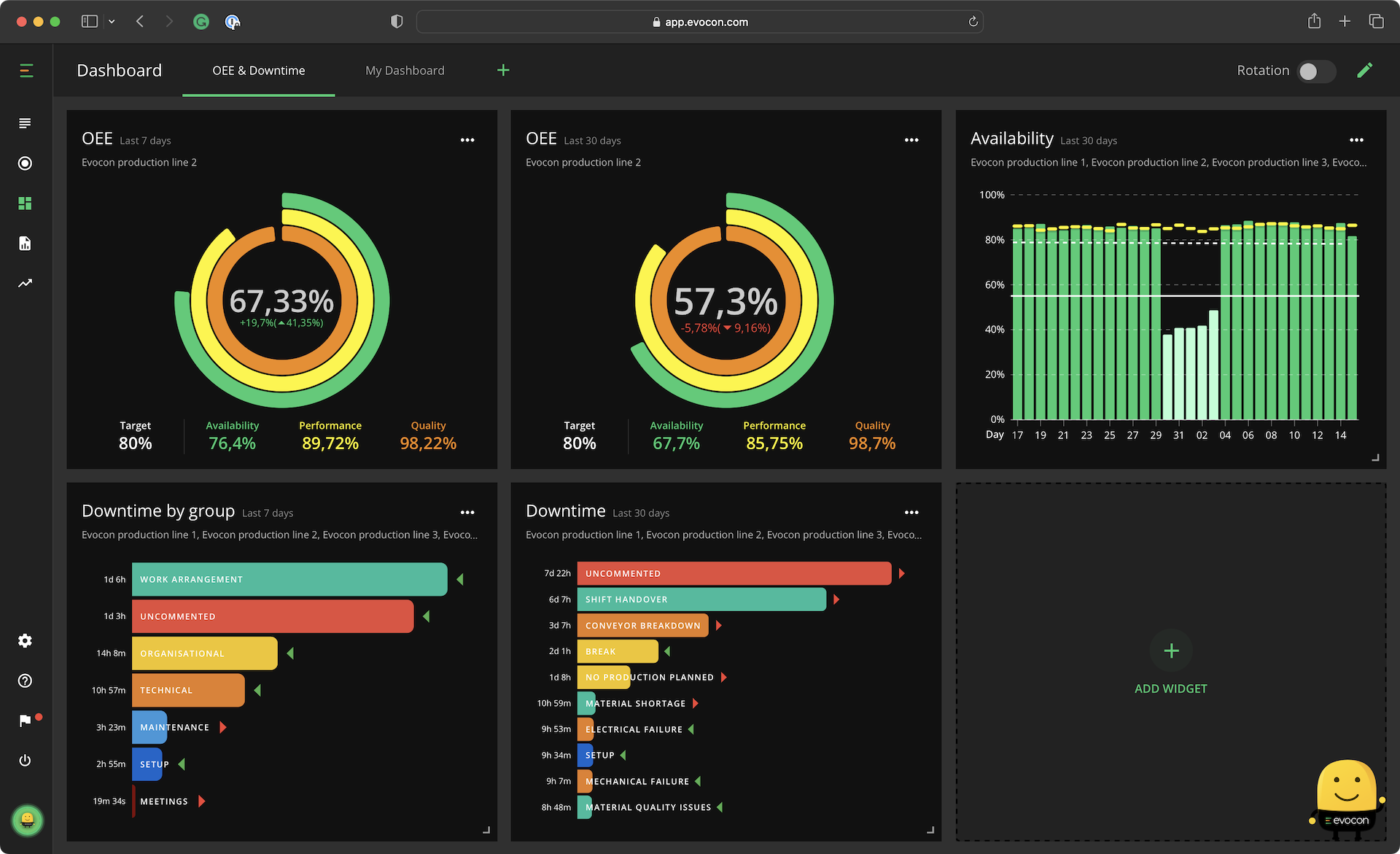
- Dashboard
The Dashboard gives managers and operators on the floor a quick overview of machine downtime. They are often configured to show machine downtime daily, weekly, or both.
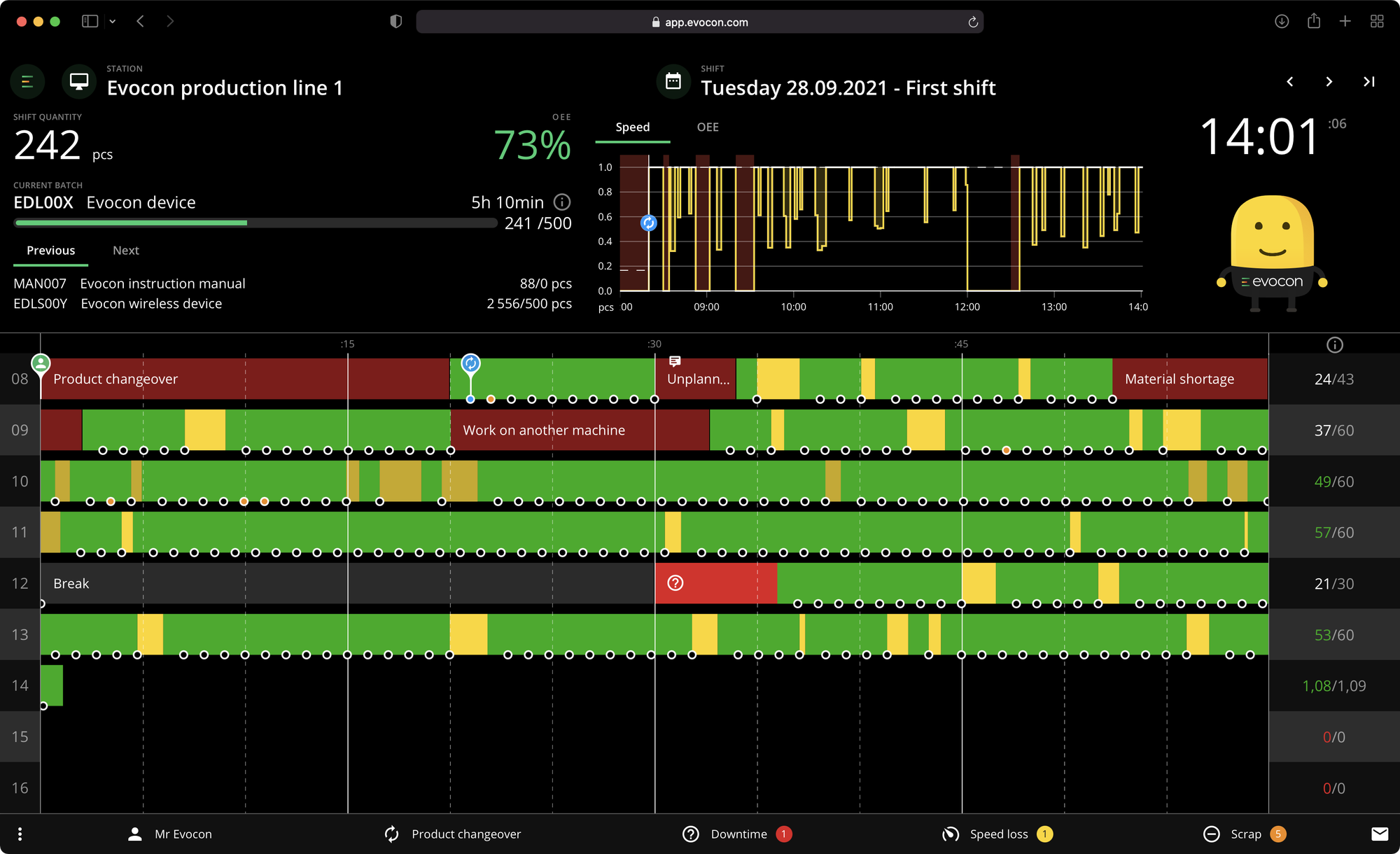
- Shift View
The Shift View in Evocon gives you an overview of how your lines are working during any shift. It provides the most detailed view of your production events as they happen. Here, you can see when your machines have stopped during the day and any stop reasons that your operators have added to the system.
By using a combination of Evocon’s Reports, Dashboard, and Shift View, factory managers and workers can keep a detailed record of downtime reasons, and get a comprehensive view of machine downtime over different periods of time.
Who performs downtime analysis?
Keeping track of downtime is important for all manufacturing company workers. That said, the different features Evocon offers provide different data that can be more applicable for workers in various teams and at different levels.
For example, operators on the factory floor will find the Dashboard and Shift view valuable to track their daily and weekly work. But it might not be relevant for them to drill down into monthly or annual reports.
On the other hand, shift leaders, production directors, or shift managers, will likely want to see weekly and monthly reports, as well as keeping an eye on the Shift View from day to day.
At a high level, we have found some of our users look at the data from our downtime reports across their factories to compare their downtime durations and reasons. One example of this is H+H, a leading provider of solutions and materials for wall building. They analyze downtime reports for each factory, and then discuss this with all of their factory managers at a monthly meeting.
Step-by-step plan to cut downtime by 15%
How to Create and Analyze a Downtime Report with Evocon
Creating a Downtime Report with Evocon is quick and easy, so you’ll have your data visualized in no time. At a glance, the downtime report clearly shows why your machines are not working and the top downtime reasons for the whole factory. By analyzing the report, and selecting different options, you will understand why your machines are down, where there are potential bottlenecks, and what to do in order to solve any issues.
The stop reasons you see are set up by your system administrator. This way you can have clearly defined options that your operators select when entering a stop reason.
Steps to analyze your downtime report
Simply put, if you aren’t measuring your downtime, you don’t know how much downtime you have. There is often a big gap between assumption and reality, leading to a substantial loss in production. By looking at accurate data, you will know your exact amounts. For example, you might assume that your lines are working 80% of the time, but when you look at the data, you discover that it is actually just 55% of the planned time they should be functioning.
Analyzing your report in Evocon solves this problem. When you open your Reports, the Downtime Report will appear by default. Here are the steps to get the most out of your downtime report.
1. Check for uncommented downtime
The first step in your analysis is to view your downtime reasons, particularly paying attention to anything uncommented. This will help you understand how much unaccounted downtime you have.
If you notice you have a high uncommented rate, it’s essential that you work with and support your operators. This should be your number one priority. You need to help them understand that commenting is not just a means of tracking their work, but it is the only way you can get accurate data to improve your factory’s overall performance. The more uncommented data there is, the less reliable your reports are.
Accurate comments inform you of why there are stoppages, and are essential to you improving your downtime.
One tip is to save your uncommented downtime chart as a default report in Evocon for quick and easy access whenever you need it. For example, if you frequently use a specific report in weekly or monthly meetings or presentations, saving it allows you to access it instantly in the future.
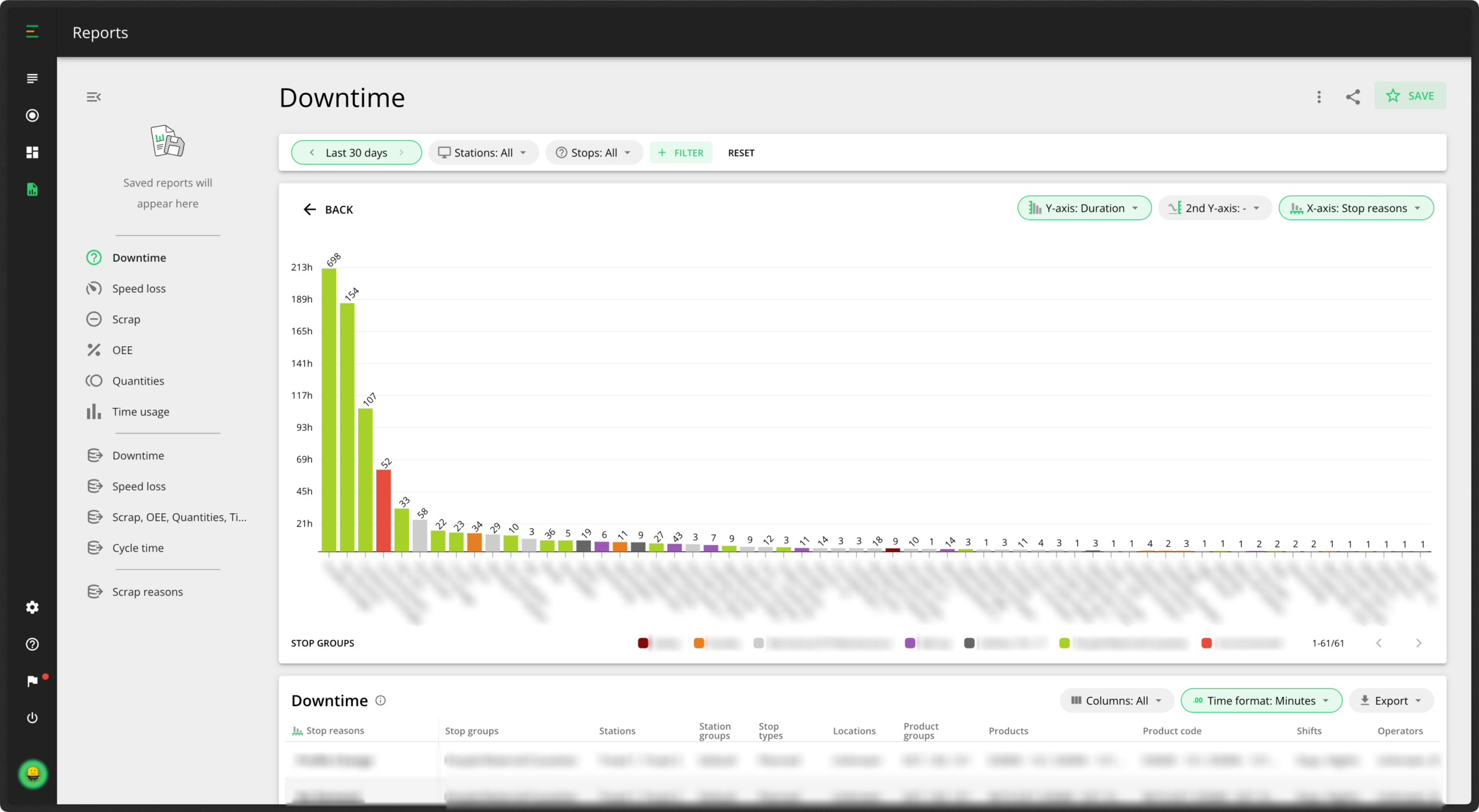
2. View by stop reasons
Now you’ve checked your uncommented stops, it’s time to figure out what is causing production stoppages. You should start your analysis by focusing on the individual stop reasons in your reports. You can then look at the processes leading up to those stop reasons. For example, you might notice that changeovers are taking the most time. Could you shorten the amount of time they are taking?
You can also view your stop reasons in groups by categorizing them to get a more holistic view of your data.
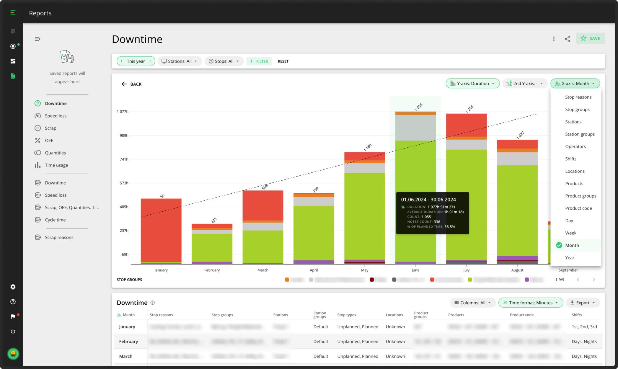
You can also view your downtime reasons over time to check how your stop reasons are trending. You want your stop reasons to trend downward. As you can see in our example below, the downtime was steadily increasing — this is not a good sign. Fortunately in this case, it has started to move downward again.
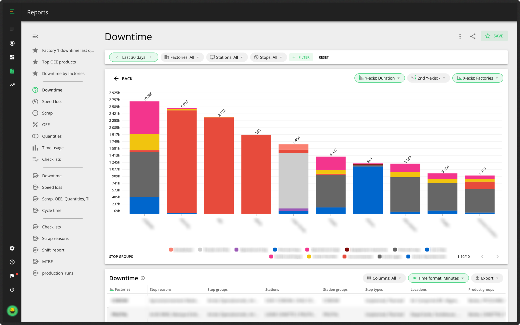
In addition to comparing different shifts, stations, and factories, in Evocon you have several other options to view the data you want. You can change the timeframe you want to see the data from, which stop reasons you’d like to display, as well as a filtering option where you can choose to view by products, operators, stop types, or locations.
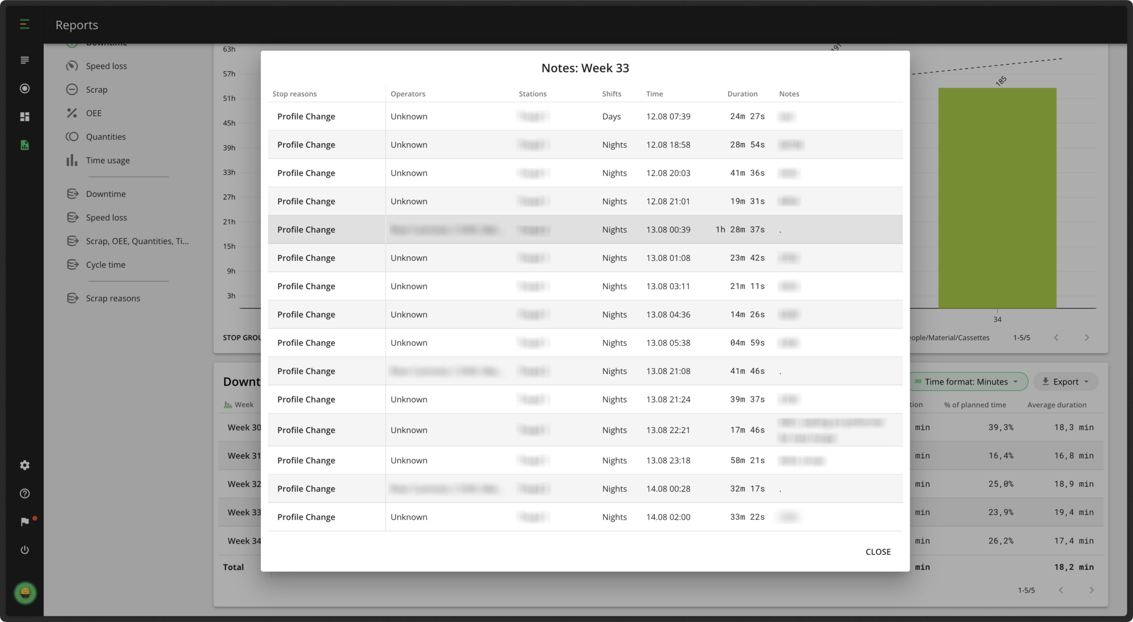
Below the chart, you have the Data Table. This shows all of the information you can see in the chart and more. The table gives an overview of all downtime reasons during the selected time period, including the stop group they belong to, location, shift and stop type. You can drill down further and narrow your analysis to individual stops, where the dynamics of each stop reason are visualized in more detail. Simply click on any element in the first column of your data table to do this. In the data table, you can also view any notes added by your operators for each stop reason. Scroll to the notes field and click on a note to open the view below. Reviewing these notes helps you gain more insight, identify patterns, and determine if the same issues are occurring frequently.
You also have the option to export your data from the data table if you want to import it into Excel or other systems.
3. Compare your data from different perspectives
When analyzing your downtime report, you have the option to view the information from different perspectives.
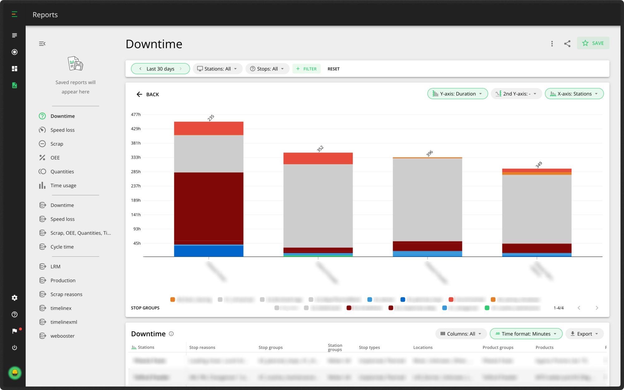
For example, if you want to compare your different shifts, you have the option to filter by shifts and understand if they have similar or differing stop reasons and amounts. Similarly, you can view your downtime reasons by station. This way you can see which of your machines have the most downtime, why, and if your operators are commenting on some more than the others.
For a more high-level view, you also compare multiple factories. This is extremely useful for knowledge transfer and best practices. If you find something was changed that is proving successful in one factory, you can then share it and implement these changes in other factories.
4. Review and refine
Now that you’ve created and analyzed your downtime reports, it’s time to review and refine your analysis regularly to ensure continuous improvement. You want to continually improve your results over time, and keep your downtime trendline moving downward, while your OEE trendline moves upwards. Once you have established a good level of OEE, and reduced your downtime, you can keep an eye in real-time on the Evocon Dashboard.
Remember that any specific reports you create with your chosen filters can be saved, and you can quickly open them up and show them whenever needed.
If you’re using Evocon already, and need help with your downtime reports, remember to check our help center for more information.